Using SamplePipeline#
A sample-level (patient-level) visualization of the gene and cell-type of interest.#
First, the data and package are loaded. This may take a minute. Set your gene of interest (GOI) here!
[1]:
import sys
sys.path.append('/lustre/groups/ml01/workspace/samantha.bening/Bachelor/')
from importlib import reload
import genereporter.sample_pipeline as spModule
reload(spModule)
sp = spModule.SamplePipeline(wdir="/lustre/groups/ml01/workspace/samantha.bening/Bachelor/", adata="data2/veo_ibd_balanced.h5ad")

GOI = 'CASP8' # set the GOI!!!
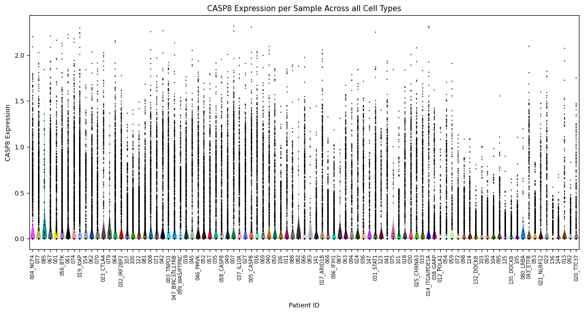
Violin plot for each sample’s expression distribution, across all cell types for the gene of interest. A scatterplot of each sample is overlayed to show the individual cells. This is particularly useful to quickly identify samples that perhaps have a very low number of cells.
[2]:
sp.pl_violin(GOI)
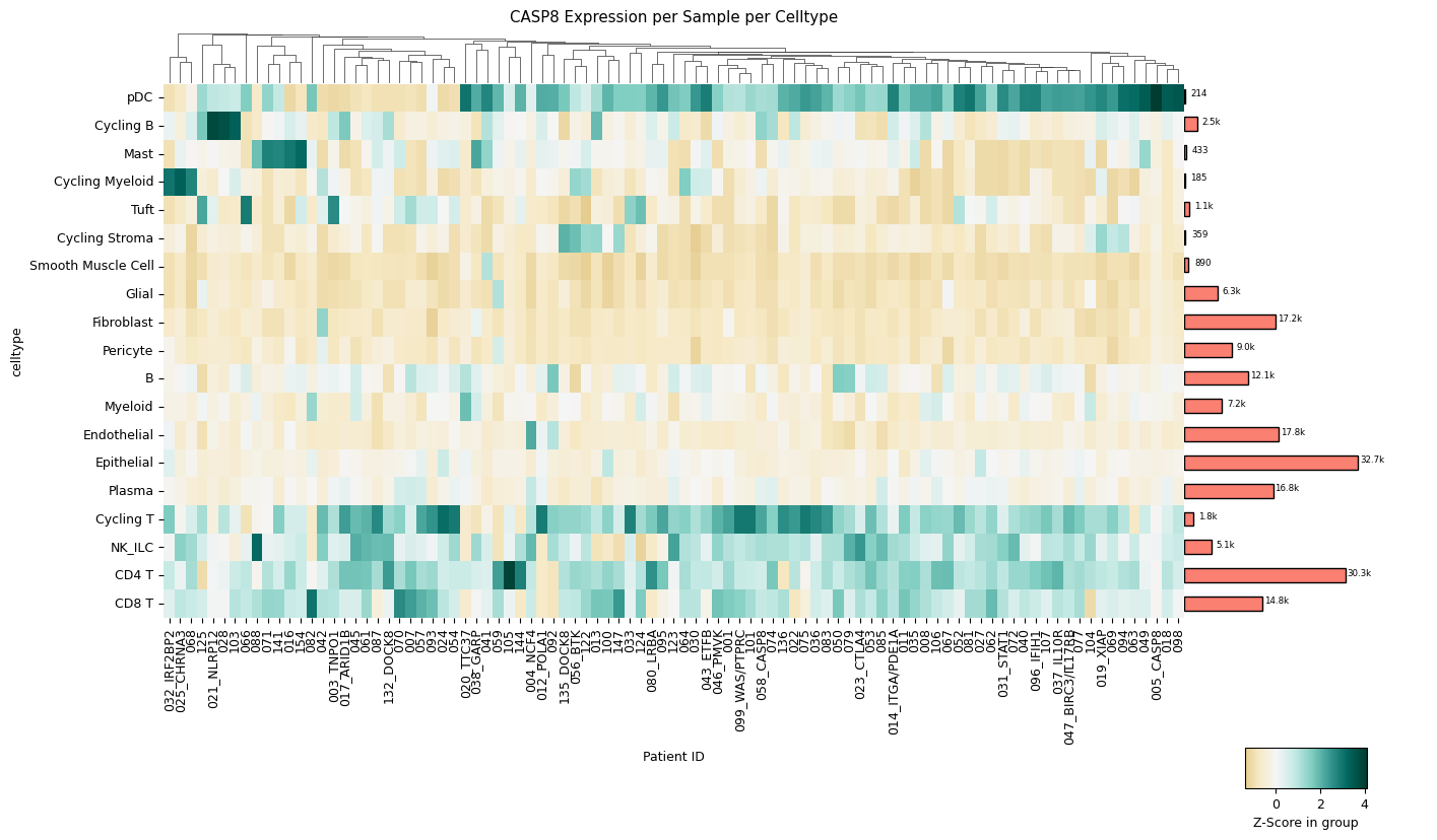
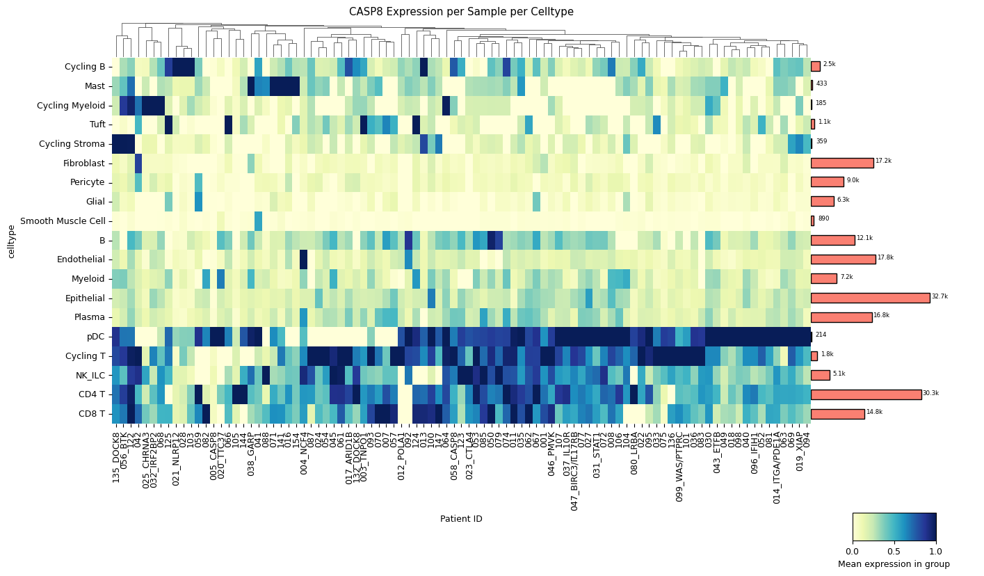
A clustermap (hierarchically clustered heatmap) across all samples for all cell types. The mean expression values are either standardized between 0 and 1 for each patient or z-score normalized. The choice between standard scaling and z-score normalization depends on the specific analysis objectives and the presence of outliers within the data. Standard scaling provides a straightforward representation of mean expression values, while z-score normalization offers robustness against outliers, albeit at the expense of directly showing mean expression values. The user can quickly change which version is created with a single method parameter: z_score=True for z-score normalization or z_score=False for standard scaling.
[3]:
sp.pl_sample_celltype(GOI, z_score=True)
[4]:
sp.pl_sample_celltype(GOI) # balanced data set
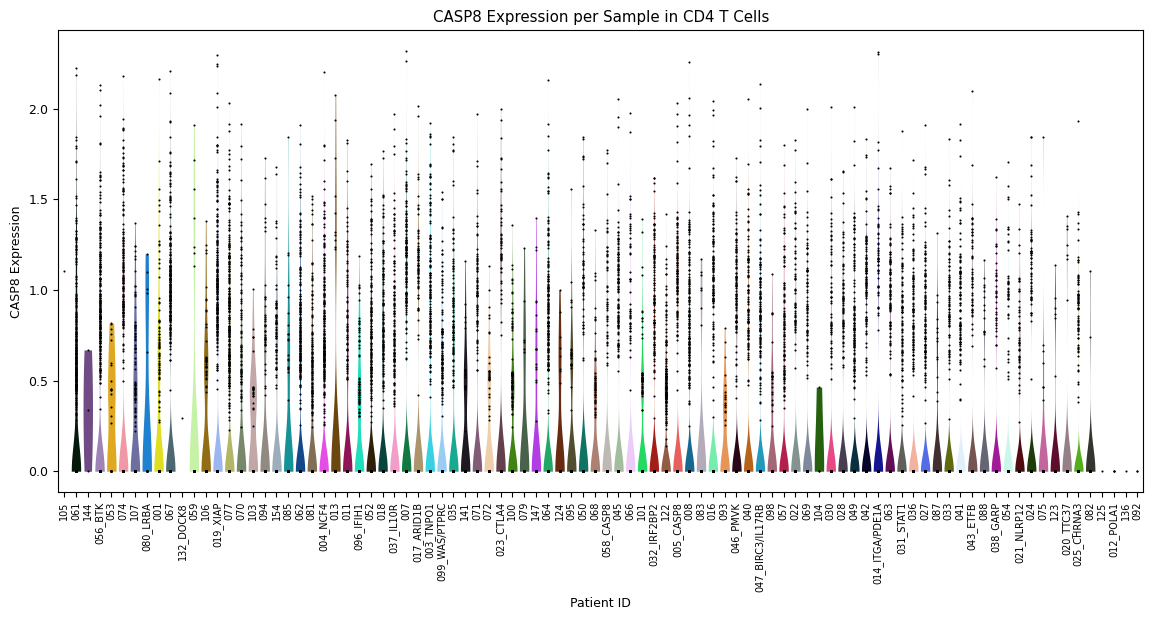
Zooming further in, a violin plot across all samples in one specific cell type (instead of over all cell types). Set this cell type using the parameter
celltype=’[your celltype here]’
[5]:
sp.pl_violin(GOI, celltype='CD4 T')